When my husband and I bought our first house, I cried; but not for joy. To put it mildly, our house was a major fixer-upper. I remember thinking that the apartment we lived in was luxurious compared to the house. But my husband had a vision, and in hindsight, I have to give him a lot of credit, because if it were up to me, we would’ve passed on this house.
We started gutting the house shortly after we bought it. Since it needed a lot of work, we didn’t live in it for the first seven months. We eventually moved in when the house was about 85% done. Now, if you’ve ever seen the movie “The Money Pit,” you can sympathize with me. It is not easy waking up to a bunch of workers in your bathroom as you’re trying to get dressed. The remodeling process is definitely stressful and honestly, it’s like having a part-time job. We were on a first-name basis with the guys at Home Depot. I remember spending every single weekend picking out things I had never given thought to before: door knobs, handle bars for drawers, floor colors? When the only “home improvement” you’ve done is buy some IKEA furniture on a student budget, this stuff is hard!
Over the course of the next few Fridays, I’ll be sharing before and after photos from our remodel. Today we begin with the most important room in a house: the kitchen.
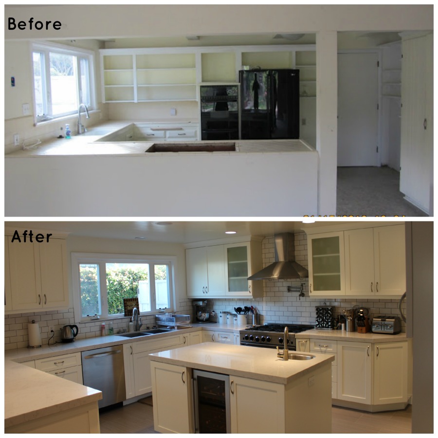
Here is what the kitchen looked like “before”. I apologize in advance for the quality of the photos; they were pre-DSLR.
OMG, right? This partially explains my tears. The master bath might have been worse, believe it or not, but that’s for another post. This kitchen needed A LOT of work. Notice the suffocatingly low ceiling? Raised that. That post blocking your way into the kitchen? Removed. Come to think of it, everything was taken out from that kitchen except for the window.
Now for the “after” photos:
So I initially thought that I wanted a kitchen with dark cabinets. It was my husband who thought about the white, and we went for it. I am now in love with white kitchens and will never go back. Don’t get me wrong, dark kitchens are nice, too. But there’s just something about a white kitchen that’s so fresh and inviting; they’re so cheerful.
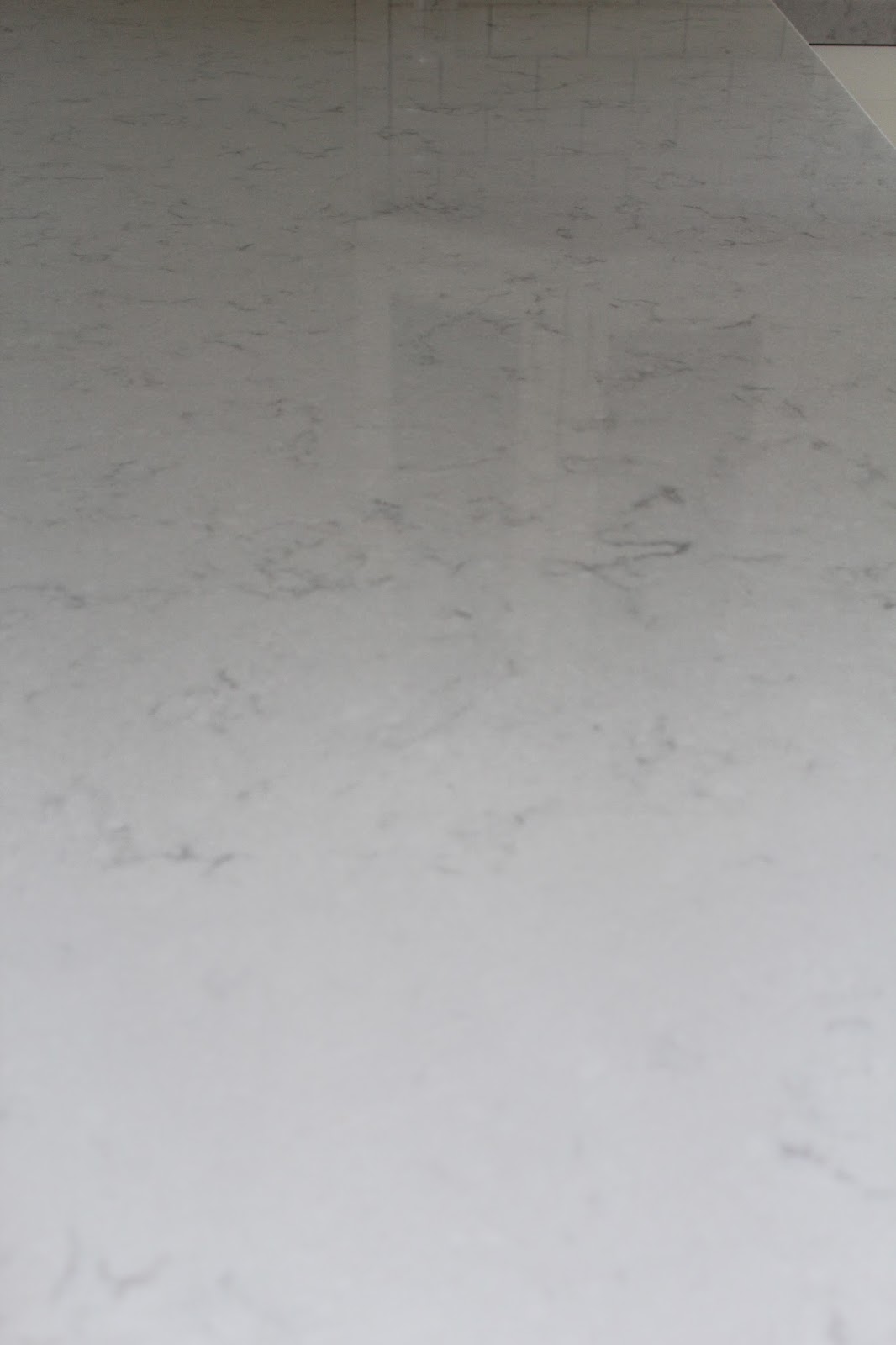
Now, the hardest thing to decide on for the kitchen were the countertops. Along with my newfound love for white kitchens, I learned that I was hands down obsessed with Carrera Marble. To me, it is absolutely beautiful and nothing can compare. So why didn’t we just go with the Carrera? Because everyone will emphasize to you how porous marble is, and that you’ll have to deal with etching and staining; that’s the patina of marble. So we searched everything from granite to quartz for something that looked like Carrera but had no luck. We eventually had to make a decision and we just said screw it, go with the Carrera … UNTIL our countertop guy showed us something he had in his shop that was similar to the Carrera: a Silestone in Lagoon. With this, we could have the look of Carrera with the durability of quartz. And THAT is what we finally went for. Now, I think we made a good choice, but if you ask me, I still love the Carrera.
The next challenge was to choose another color to break up all the white in the kitchen. We chose grey to complement the grey in the Silestone.
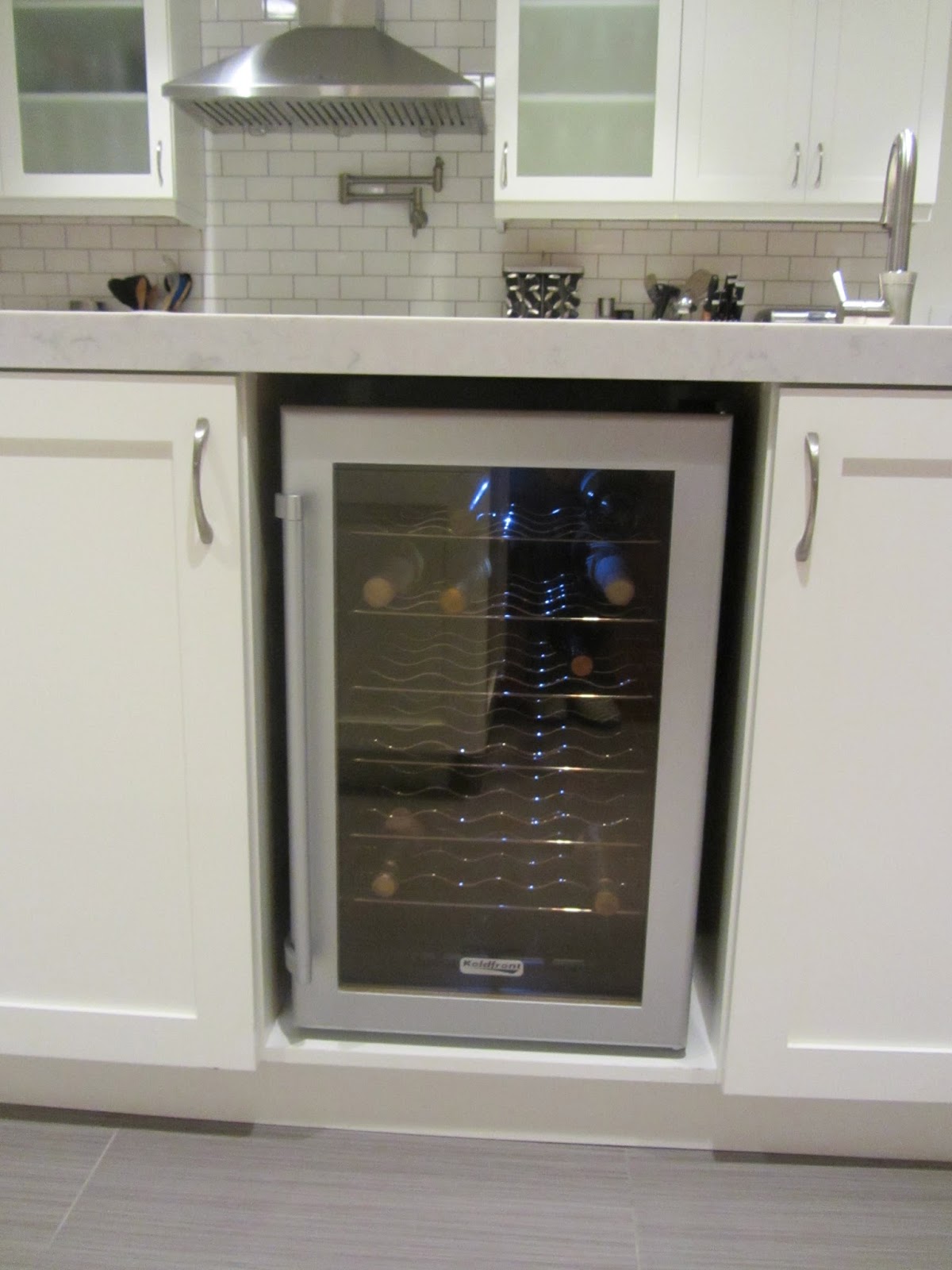
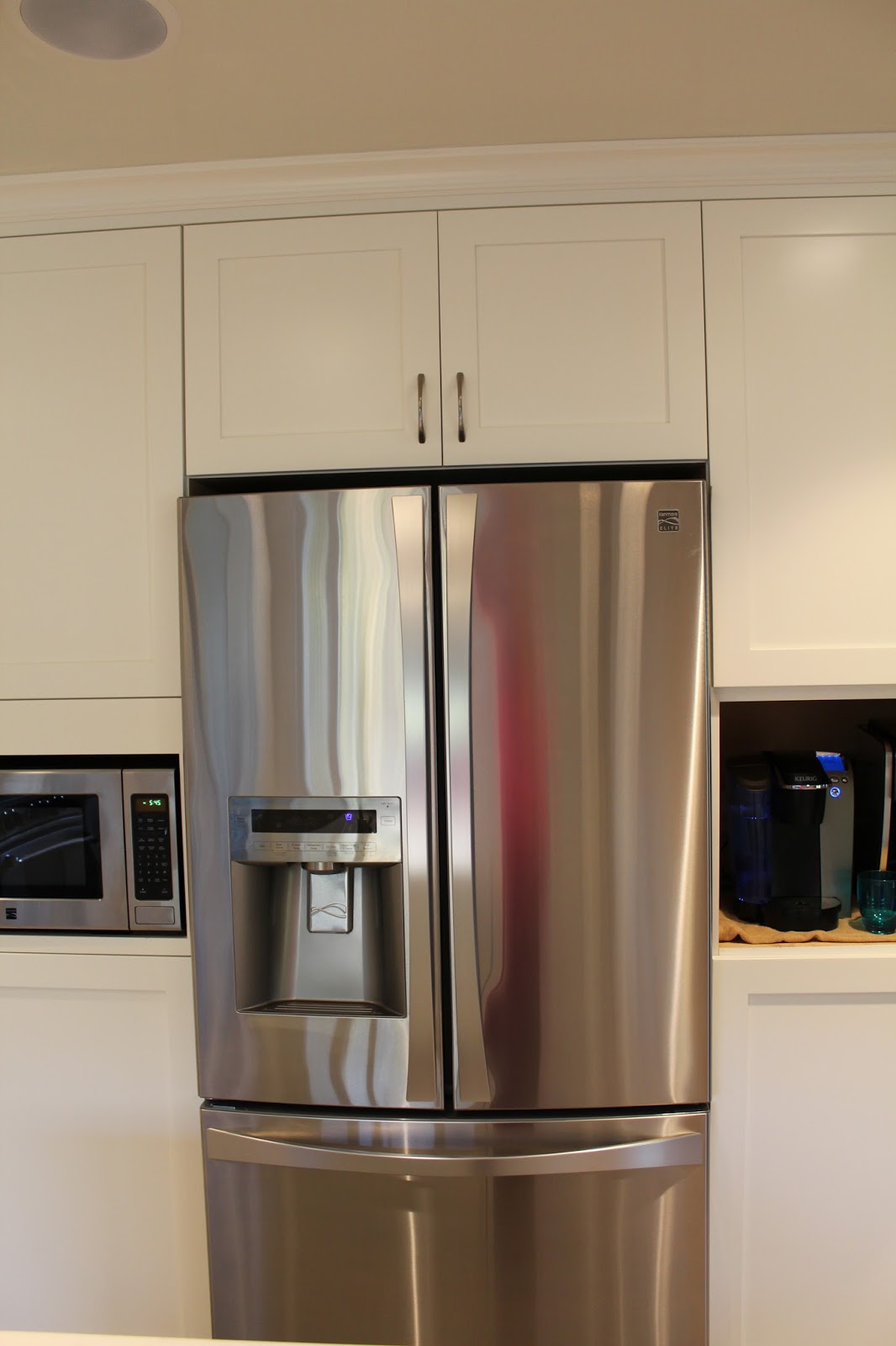
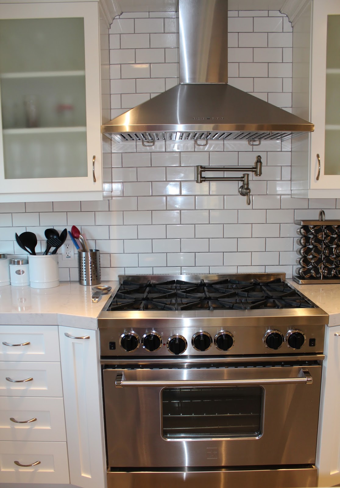
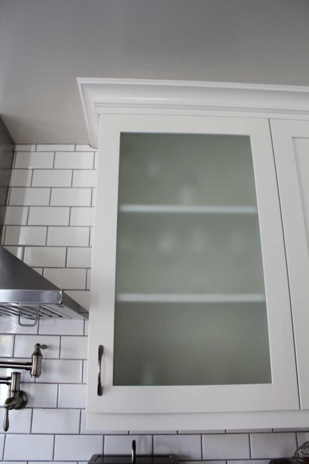
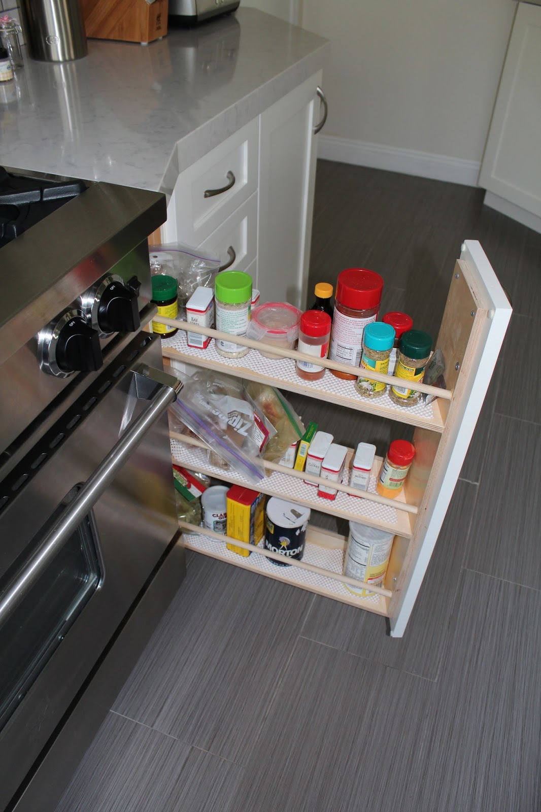
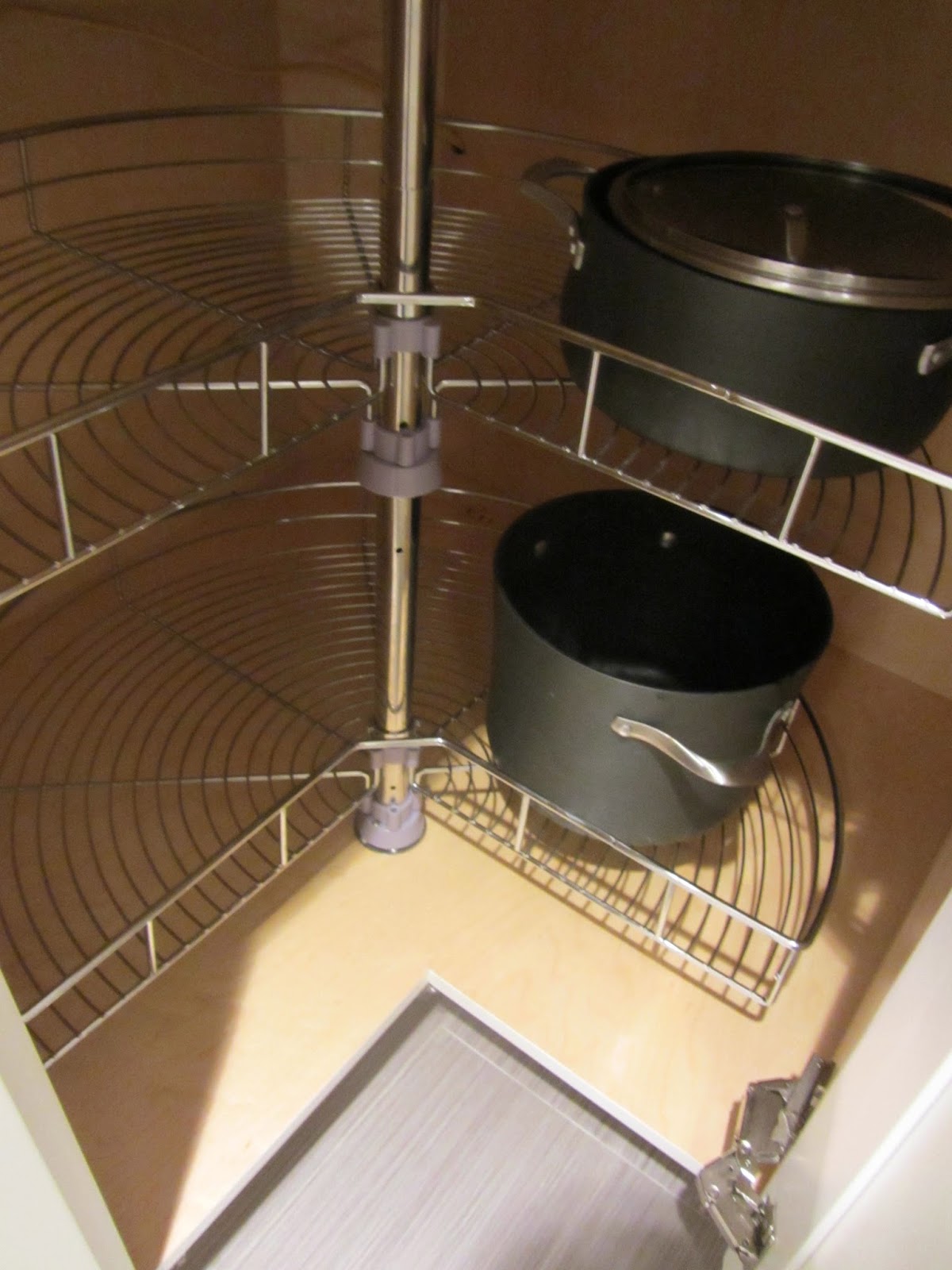
Here are some more details
Hope you enjoyed the kitchen tour! Next week: the master bedroom and bath.



pretty sure this kitchen couldn't be anymore perfect. We are also doing a little remodeling and I can't wait to be able to post some progress!
-Ash
http://sparkleandsoul.wordpress.com
Thanks, Ash! It was a ton of work, but worth it in the end. Good luck with your remodeling!
Could you tell me the name of your pendants or where they are from? Thank you! Stacie
Hi Stacie! I'm not sure of the name, but I bought them from Lowe's! Hope that helps!
Thank you!