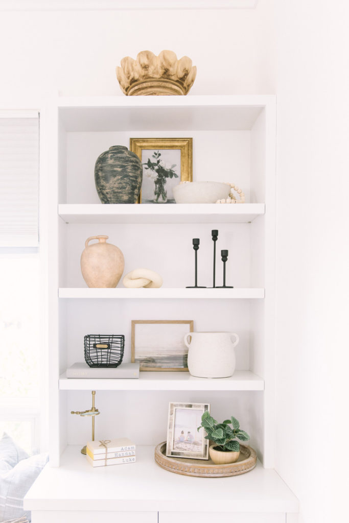
Personally, I think less is more when it comes to styling your shelves. You want to give the objects some breathing room and not cram a bunch of items onto the shelf. So just keep that in mind as you go about your styling.
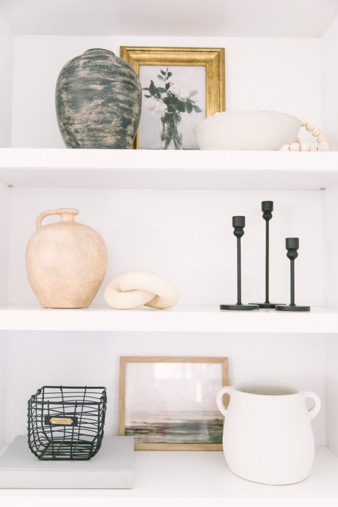
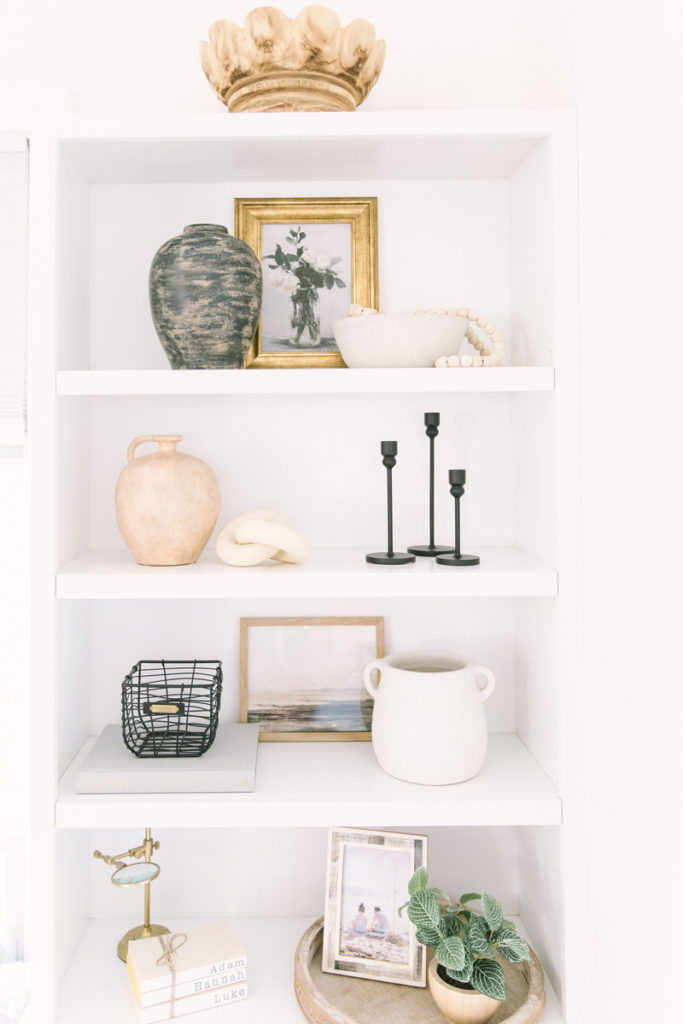
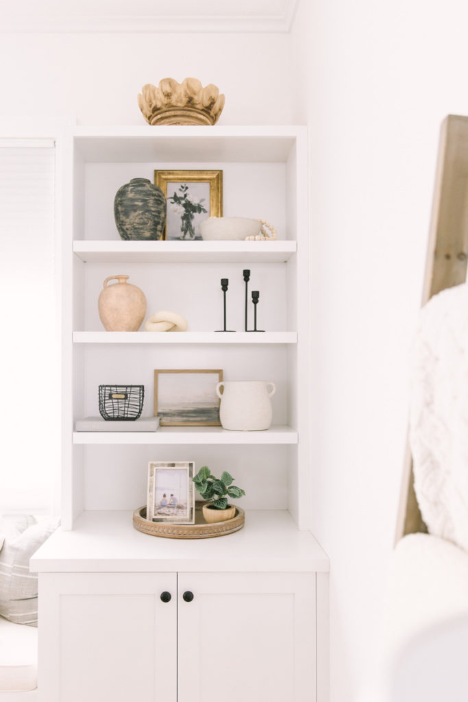
Okay, so first you should pick a color scheme. For mine, I chose some neutral shades with black as my accent color. I then made sure to incorporate that accent color on each main shelf in a zig-zag pattern.
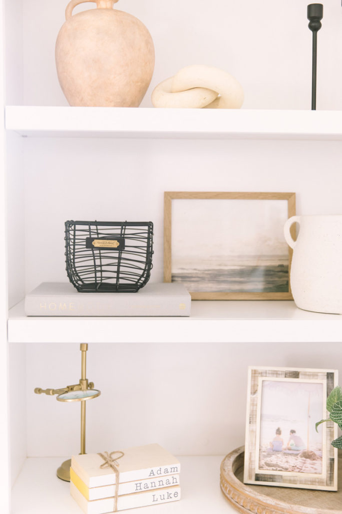
Next, be sure to use varying heights and sizes to add visual interest; taller objects to draw the eyes up, and smaller ones to draw them back down. Books are a great way to add height to smaller objects. On a similar note, I like to zig-zag my tall objects on each shelf as well. Try to avoid having all the tall objects lined up on top of each other.
I also like to use different types of textures. Here, I’ve incorporated wood, concrete, earthenware and metal.
Next, layer in artwork to add depth. I like to print and frame affordable art from Etsy. That way, it’s super easy to change out the artwork to reflect the seasons.
I then like to add in some greenery and call it done. But there’s actually one more step: edit, edit, edit. Don’t worry about getting it right the first time. I constantly have to step back and assess how I like the look. In fact, even after I thought I was done and snapped these photos, I went back and edited my base shelf because I thought it looked too busy. So just play around with it until it’s to your liking.
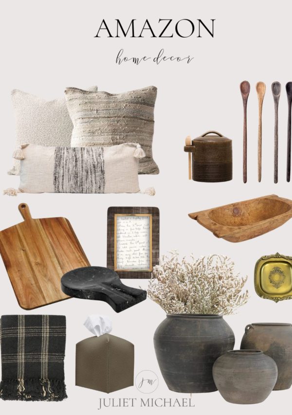
That’s it! I hope this helps and takes out some of the stress of shelf styling. I’ve also included some of my favorite shelf-styling decor at the end of this post. Be sure to tag me on Instagram if you use any of these tips for your shelfie. You can also check out my reels there to see these shelves being styled in action.
Leave a Reply