This Friday’s flip is about the master bedroom and bathroom. If you read last week’s post on the kitchen, I warned you that the master may have been worse. I’ll let the “before” pictures speak for themselves. And again, I apologize for the quality of the photos:
Here we have turquoise (?) carpet. Why someone would ever choose this color I will never know. But wait, it gets better…
Pictured above, friends, are the entries (yes, plural) into the master bath. I suppose they’re “his and hers” entries? There were things about this house I just didn’t understand.
Now, not only did we have separate entries into the bathroom, but you could also enter the shower from either side. Yes, this means that the shower was in the middle of the bathroom, and you and your significant other could play pick-a-boo between the double shower doors.
See that space across the shower door to the right? That was the master closet. And yes, there’s one on the other side as well. His and hers.
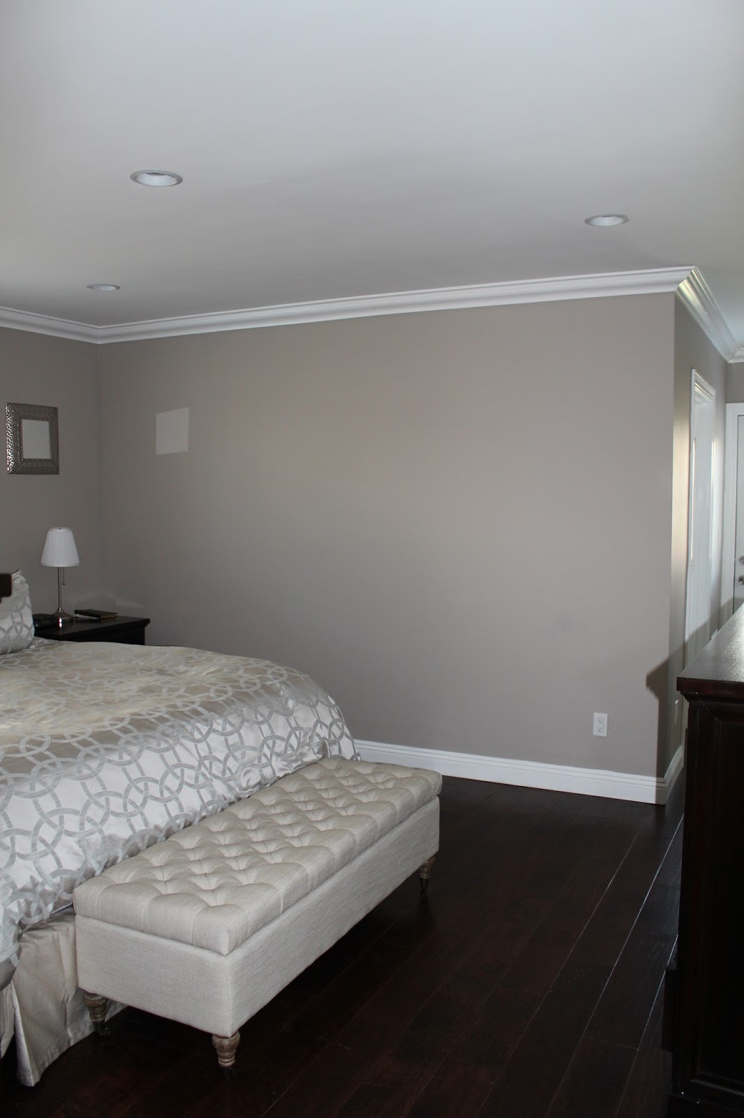
As you can see, the sea of blue got replaced with hardwood floors, walls were painted, crown molding was added, and…
the room was expanded. We created this walkway with a door leading to the yard. See the mirrors on the right? That was were the yard entry used to be, but with an addition to the house, we made this a walk-in closet (pictured below). The entry (singular) to the left is the master bath.
Can you even believe that this is the same bathroom? We still have the “his and hers” concept, but with double sinks, not separate entries.
Although we didn’t feel comfortable installing marble in the kitchen, we did it with the master. I love the “dip” in the counter space to create a vanity.
Probably the deepest and longest tub you’ll ever sit in; I swam laps in this thing.
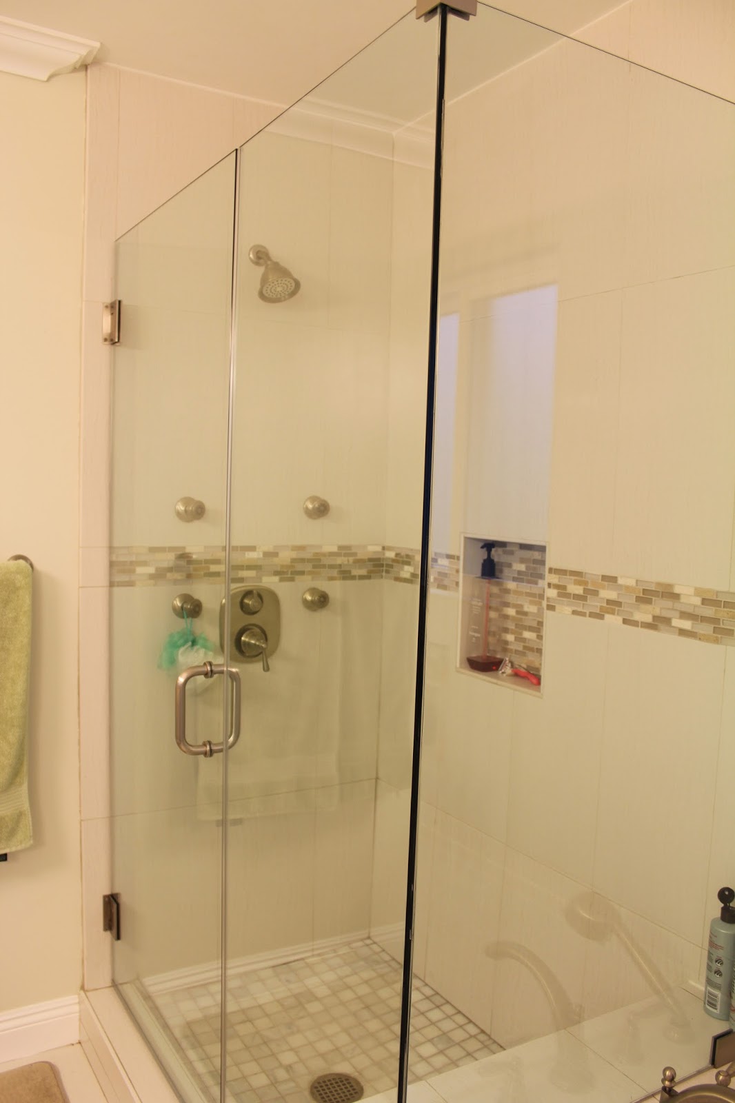
Separate stand-up shower.


Leave a Reply